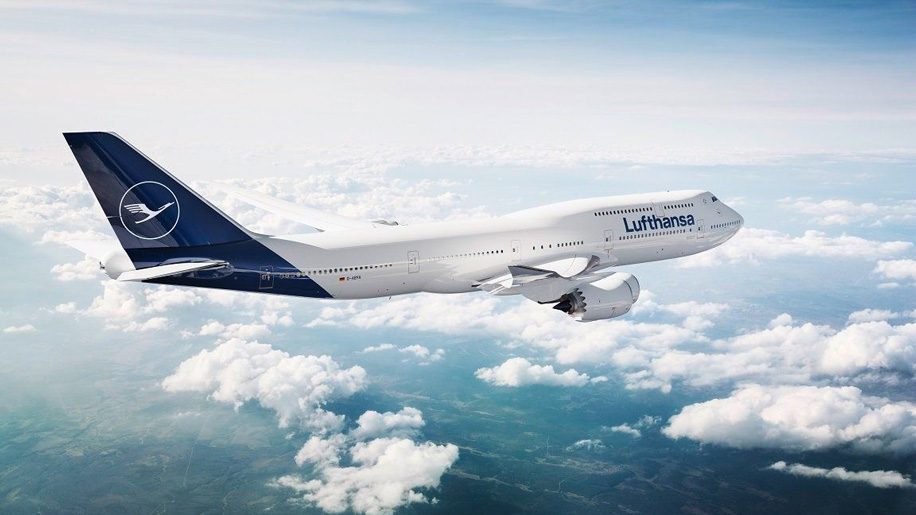
Readers of this website will now be familiar with Lufthansa’s new livery which has come under a fair amount of criticism.
The new design was quite a change for such a conservative airline and, according to analysts, probably the biggest change in the company’s history.
But after only a few weeks Lufthansa quietly admitted it had ‘got in wrong’. It seemed that Lufthansa felt the new blue appeared like black in poor light. To some this gave its aircraft a funereal appearance.
There was much negative feedback from both Lufthansa customers and readers of businesstraveller.com.
Lufthansa then decided to make the shade of blue lighter (note: aircraft already repainted will continue with the previous new blue).
The first aircraft (a B747-400) bearing the revised blue made its appearance a few weeks ago after being painted in Dublin.
The revised blue is definitely lighter. But, let’s face it, it’s now summer and it still remains to be seen how it will appear in the gloom of a Northern European winter.
Now aviation publications airwaysmag.com and aero.de have published an interview with Lufthansa which reveals the final livery was chosen from no fewer than 200 designs.
There are interviews with Lufthansa’s marketing chief Alexander Schlaubitz and designer Ronald Wild.
Scroll down the page (see links above) and you will see four of the designs which were not used.
Which do you prefer? Today’s new look or one of the other four. I am sure opinions will be mixed.


