
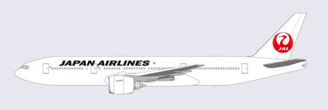
Japan Airlines is to reintroduce the familiar “soaring Japanese red-crown crane” as its new logo, in a move “symbolizing a fresh start for the airline group”.
The “new” logo, which features the bird with its wings extended in full flight, was first registered as a trademark by JAL in 1959, and was used on the carrier’s livery for more than 40 years “during the period of JAL's international network expansion”.
 The logo will be introduced from April 1, and will gradually be phased in over the next few years on the airline’s fleet, signage, name tags and stationery, with JAL’s Boeing 767-300ER aircraft the first to be repainted. Staff uniforms will however remain unchanged.
In a release JAL said that the symbol of the crane “has come to be associated with the nation's distinct hallmarks of pristine quality and reliability”, values that the carrier says it is “determined to safeguard”.
The Japanese carrier has undergone a corporate restructuring programme over the last year in a bid to return to profitability, with its workforce being cut, loss making routes scrapped, and its fleet size reduced by over 100 aircraft.
JAL’s membership of the Oneworld alliance had been subject to much speculation in early 2010, with rival alliance Skyteam and its founding member Delta offering financial support to the ailing carrier. But the carrier ultimately opted to stay with Oneworld, and has since signed a transpacific joint venture agreement with fellow alliance member American Airlines.
For more information jal.com.
Report by Mark Caswell
The logo will be introduced from April 1, and will gradually be phased in over the next few years on the airline’s fleet, signage, name tags and stationery, with JAL’s Boeing 767-300ER aircraft the first to be repainted. Staff uniforms will however remain unchanged.
In a release JAL said that the symbol of the crane “has come to be associated with the nation's distinct hallmarks of pristine quality and reliability”, values that the carrier says it is “determined to safeguard”.
The Japanese carrier has undergone a corporate restructuring programme over the last year in a bid to return to profitability, with its workforce being cut, loss making routes scrapped, and its fleet size reduced by over 100 aircraft.
JAL’s membership of the Oneworld alliance had been subject to much speculation in early 2010, with rival alliance Skyteam and its founding member Delta offering financial support to the ailing carrier. But the carrier ultimately opted to stay with Oneworld, and has since signed a transpacific joint venture agreement with fellow alliance member American Airlines.
For more information jal.com.
Report by Mark Caswell


Be up-to-date
To see our latest subscription offers for Business Traveller editions worldwide, click on the Subscribe & Save link below