
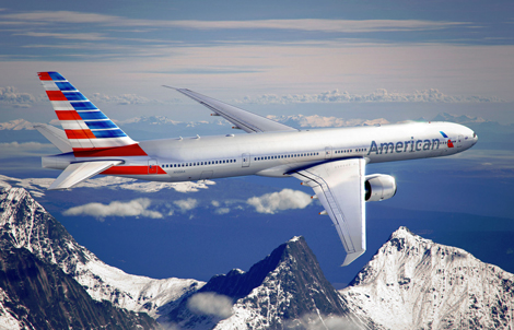
American Airlines has unveiled its new livery and logo, ahead of the launch of the carrier’s first B777-300ER aircraft.
The livery uses silver mica paint (with many of the carrier’s new aircraft being built with composite material that requires painting), with a tailfin featuring red, white and blue stripes.
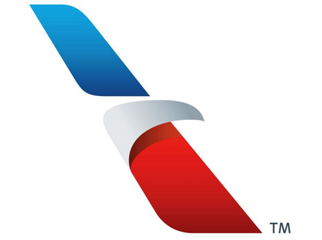
 The logo has also been revamped, with the iconic eagle symbol being updated into a streamlined image.
Announcing the new corporate identity, AA said that “Since the polished metal look was no longer an option, the importance of the paint selection became critical to honouring American’s silver bird legacy”.
“Silver mica paint was chosen as a way to maintain the silver heritage which American people and customers are passionate about, yet progress ahead with a clean new look.
“Our core colors — red, white and blue have been updated to reflect a more vibrant and welcoming spirit. The new tail, with stripes flying proudly, is a bold reflection of American’s origin and name.
“And our new flight symbol, an updated eagle, incorporates the many icons that people have come to associate with American, including the ‘A’ and the star.”
The new livery will feature on the carrier’s forthcoming B777-300ER aircraft, set to enter service at the end of this month.
An on-demand video of the new livery and logo can be streamed at aa.com/newamerican.
What do you think of the new design? Leave your comments below, or have your say on our forum.
The logo has also been revamped, with the iconic eagle symbol being updated into a streamlined image.
Announcing the new corporate identity, AA said that “Since the polished metal look was no longer an option, the importance of the paint selection became critical to honouring American’s silver bird legacy”.
“Silver mica paint was chosen as a way to maintain the silver heritage which American people and customers are passionate about, yet progress ahead with a clean new look.
“Our core colors — red, white and blue have been updated to reflect a more vibrant and welcoming spirit. The new tail, with stripes flying proudly, is a bold reflection of American’s origin and name.
“And our new flight symbol, an updated eagle, incorporates the many icons that people have come to associate with American, including the ‘A’ and the star.”
The new livery will feature on the carrier’s forthcoming B777-300ER aircraft, set to enter service at the end of this month.
An on-demand video of the new livery and logo can be streamed at aa.com/newamerican.
What do you think of the new design? Leave your comments below, or have your say on our forum.


