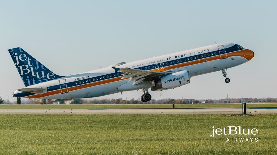
Jet Blue has unveiled a new 1960s “RetroJet” livery, designed to celebrate the iconic jet age and “highlight Jet Blue’s innovative style”.
The US carrier only started operations in 2000, and so was forced to “reverse-engineer” its current brand by consulting archives of popular logos and notable companies from the mid-1960s, in order to “envision what the customer-friendly carrier of today might have looked like some five decades ago”.
The one-off A320 livery features orange and blue “speed stripes”, with JetBlue Airways “printed in a font consistent with a typeface widely used in the time period”, and a three-coloured tailfin featuring “a lively 1960s jazz-inspired font that would have stood out among other airlines of the time”.
The carrier said that designers spent time at New York’s Lubalin Archive at the Cooper Union, “pouring through original advertisements, graphics, images and fonts from the 1960s”.
Commenting on the livery Jamie Perry, vice president marketing, Jet Blue said:
“The 1960s were rich with sleek but bold graphics and style – characteristics of today’s Jet Blue brand.
“With that in mind our team broke from our tradition of timeless designs and instead imagined a look to celebrate this iconic era of aviation and what Jet Blue may have looked when it would have been introducing humanity to air travel.”
The A320 aircraft has been launched on Jet Blue’s service between New York JFK and Palm Springs International, a route chosen “because of the desert destination’s mid-century modern architecture and style”. Over time it will operate on routes across the carrier’s network.


